#BFF
Client Work: Black Female Founders Website Redesign
Black Female Founders
Redesigning/streamlining content to refresh a tech accelerator’s brand and highlight its value
Role: Content Strategist
Organization: Wayfair
Timeframe: Two week sprint
Tools: Sketch, Abstract
Challenge: Reorganizing and streamlining#BFF’s website content in a way that allows the company to highlight its valuable work, inform users about the programs offered, and broaden its audience. Creating an updated website design that would act as a brand refresh for #BFF.
Background: During my UX Design Immersive fellowship at General Assembly, I worked as part of a three-person team to create an updated website design as part of a brand refresh for #BFF. We focused on creating a website redesign based in user/market research, and our design work was high level, with my attention focused on content. To that end, we kept #BFF’s current tricolor scheme which consisted of red, fuchsia, and yellow. We carried this color scheme throughout our deliverables, including our resulting high fidelity prototype. I took the lead on developing content and ensuring that our material was aligned with the company’s voice and goals.
Project Goals & Problem Statement

#BFF's website redesign and brand refresh goals were threefold:
Raise awareness of the discrepancy in the level of funding black female led tech ventures receive compared to other ventures
Highlight the work the company is doing to combat this discrepancy (specifically a tech accelerator program called #BFF Labs)
Foster a community for black women in the tech space to network, find mentors, and share strategies/sucessess

Content Analysis
In order for our project to be rooted in a content-first approach, I took the lead on a content analysis/audit. My teammates and I reviewed #BFF’s website, clicking through each page and making note of the types of content that were on the website, how the content was organized, and whether the content was displayed in a way that was intuitive to users.
Another important consideration was that our updated website design and content recommendations needed to take into account how the client wanted the site to evolve in the future. One of the client’s goals was to create a media hub on the site that would include content such as videos, social media interaction, and blog posts from thought leaders. We kept this requirement in mind as we moved through the project phases.
The analysis revealed helpful insights, such as the fact that the toolbar sections needed to be changed. #BFF’s main product is #BFF Labs, a tech accelerator program that enables founders to learn how to launch their businesses and gain funding. One of the toolbar options was #BFF Labs, and we noted to the client that a new user to the site would not have a frame of reference for the product, so they would not know what to expect when clicking on the page.
Content Discovery

User Journey
Before jumping into the process of considering how to present the website content, it was necessary for us to understand our users and their behaviors.
We created a user journey to map out how a #BFF audience member might go through the steps of learning about #BFF, to participating in #BFF Labs, to becoming a part of the community and helping to mentor other founders.
As we began to understand more about our audience, we asked ourselves questions to ensure that we would be best placed to create a website design that delivered information to users in the most effective way.
I posed questions such as:
What are our users’ needs, beliefs, and behaviors?
What are our users’ pain points and frustrations?

Competitive Analysis
Keeping our user research in mind, we focused on uncovering insights pertaining to the business side of the process, because we felt that this would help inform our content decisions.
We conducted market analysis to gain an understanding of #BFF’s place in the current tech space. We compiled a competitive analysis by comparing the websites of #BFF’s competitors, taking note of aspects of each site that stood out in a positive, negative, or unique way.

SWOT
After comparing #BFF with its competitors, we created a SWOT analysis to uncover opportunities for enhancements to #BFF’s website that would raise the brand’s profile with current and potential users.

User Personas
After conducting our content discovery, and reflecting on our initial conversations with our client, we ascertained that #BFF’s audience consisted of three main groups.
Understanding the behaviors and desires of these groups allowed us to make decisions regarding the content that was necessary for the website.
Information Architecture
Once we solidified the users we were designing for, we created a sitemap that encompassed all of the sections of the updated website design.
Interface Design
Mid Fidelity Wireframes


Usability Testing
To test our redesign and gather feedback on our wireframes, we contacted current users of the #BFF site, and users who had been part of a previous #BFF Labs cohort. We created a video of our clickable prototype, and requested that the users view the video to get a sense of how the updated site would operate. We sent out a follow-up survey to collect the users' thoughts regarding the proposed layout, organization, and content structure of our prototypes.
Feedback from users:
Be mindful of the amount of copy on individual pages; too much copy is overwhelming
Highlight the testimonials section of the homepage
The "Why We Do It" and "Impact" sections of the prototypes are impactful
Site cleanliness and navigation elicits a positive reaction

Style guide
A style guide enabled us to ensure that our interface design was cohesive.
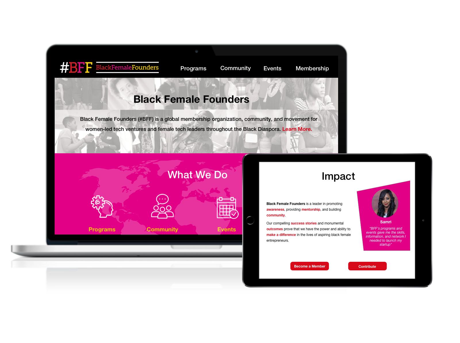
Final Prototype
After taking into account the feedback and insights gained from our testing, we made iterations on our wireframes. The final result was a high fidelity prototype that reorganized the website content into a streamlined flow for users, and aligned with the #BFF brand. The updated layout made #BFF's mission clear, highlighted the efforts #BFF is making to elevate diverse tech ventures, and enhanced the user experience.

Results
The final mockup took into account all of our content decisions, and resulted in a shipped product.
At the end of our project we received feedback from the client that confirmed that #BFF’s needs were met through our deliverables. Our client felt that our work encompassed #BFF’s goals, while enhancing the design of the website. Our design recommendations were implemented, with some adjustments, on the updated #BFF site.