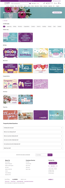
Gift Card Landing Page Redesign
Redesigning the gift card landing page to increase visual appeal, delight customers, and reach business goals
Timeframe: Several months, divided into two-week sprints
Tools: Google Docs, Abstract, Sketch
Collaborators: Product management, product design, UX research, business, marketing, engineering, QA
Context: Working cross-functionally, I spearheaded the content strategy initiatives as part of a redesign of Wayfair’s gift card purchasing process. Wayfair’s gift card experience was lacking in terms of its features and functionality, and its adherence to Wayfair’s design system standards. The experience required an overhaul, rather than incremental improvements.
By redesigning the shopping experience with a customer-first perspective, and focusing on clear content and streamlined information architecture, I was able to add delight to the gifting experience, and make strides toward Wayfair’s goal of becoming the number one gift card in the home shopping category.
Previous gift card experience
Problem
The current gift card experience was not meeting these customer expectations:
Prominently displayed gift card categories and delivery options
A higher number of designs and categories to fit unique customer needs
An appealing design flow, visuals/illustrations, and customizable gift card options
Key features such as a balance check section
There was a need to create an updated page that was visually appealing. Increasing the visual appeal could help Wayfair’s gift cards become more popular with online consumers, so that Wayfair could compete with other retailers such as Amazon and Target.
Objective
Understand customer behavior regarding gift card purchases
Improve the customer experience and exceed customer expectations (customizable card options, gift card browsing experience, expedited shipping option, elevated visuals, check gift card balance tools), which will help increase sales
Rebuild gift card landing pages to make them scalable and flexible; make shopping flow and underlying structure consistent across Wayfair brands and international geographies


Process
Discovery → Ideation → Design Sprint → Prototyping → User Testing
I started with research, conducting a competitive analysis of top retailers’ gift card experiences to use as benchmarking.
Next steps:
Obtained alignment on the goals of the landing page redesign by communicating with cross-functional partners
Planned and executed a design sprint
Refined and tested the prototype that resulted from the design sprint; used Usertesting.com to gather insights from consumers
Collaborated with cross-functional partners to implement updated design across Wayfair brand sites and international geographies
Solution
Create an updated design that:
Helps grow direct sales onsite and generates incremental value by attracting new customers (which amounts to 30% of gift card redemptions) and increasing purchase frequency/spend
Enables targeted marketing of users
Drives conversion of customers: drives deeper engagement and loyalty through attracting and retaining customers
Resulted in a consistent experience, which allowed for an opportunity to increase funnel metrics/customer conversion and address customer experience gaps
Results
The new gift card experience responds to users’ mental models regarding the actions they’d like to take on the gift card page, and the information they need to move forward with a purchase.
The redesign:
Implemented UI that guides the user by leading with the delivery method options, thus simplifying their search for a gift card to purchase
Elevates the gift card experience’s features and functionality, which aligns with the goal of providing a better experience for users
Aligns with Wayfair’s long-term business strategy, and moves toward the long-term vision of having Wayfair’s gift cards become number one in the home retail category


