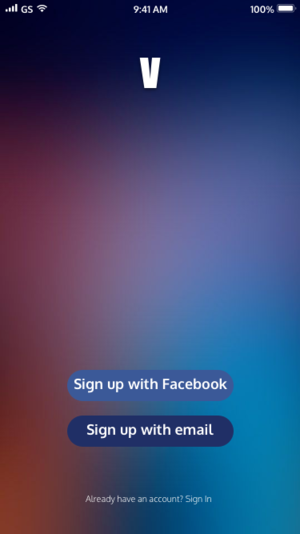
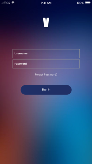
Voyager
Increasing Air and Space Museum visitor engagement through an AR mobile app
Role: Content Strategist/UX Researcher
Timeframe: Two week sprint
Tools: Sketch, Canva
Challenge: Creating a mobile app design that allows museum visitors to travel through exhibits in a way that is engaging yet educational.
Background: For this project, I worked as part of a three-person team to create an augmented reality mobile app for Smithsonian’s National Air and Space Museum.
Content Discovery
To create a foundation for our mobile app design, I conducted user research, gathering data to support our UX process. I used this research to inform the content strategy for Voyager.
I conducted market analysis to gain an understanding of the Air and Space museum's place in the museum realm, and to learn about competitors. I compiled a competitive analysis by comparing the websites of competitors, taking note of the strong and weak aspects of each site and brand.
After comparing the museum with its competitors, I created a SWOT analysis to uncover opportunities for the Air and Space museum.
Survey Results
User Personas
Our user personas were created out of our research on the museum's current and targeted future users.
Our three personas were:
A mother of two who wants to keep her children entertained, while still ensuring that they are learning
A middle-aged teacher chaperoning a group of middle school age students from out of town
A businesswoman who is in town for a conference and looking for something to do after a day of meetings
Information Architecture
Once we solidified the users we were designing for, we created a sitemap that encompassed the sections of the mobile app. The next step was to document the steps that users would take through the mobile app.
Content Decisions & Interface Design
User Flow
As we created the user flow, we realized that there was a lot of detail necessary to clearly illustrate how a user would experience the app. To make the process clear for new users, we decided that it was imperative to focus on onboarding. This impacted our content decisions because it led us to create a series of screens that introduced users to the app, and explained the steps to beginning a quest, in detail.


