Expedia Trip Assist
Creating a gamified to-do list that allows trip bookers to easily organize their travel while earning rewards
Timeframe: One month, divided into two two-week sprints
Tools: Figma
Collaborators: Product management, product design, UX research, engineering
Context: I embarked on a large initiative with cross-functional partners to create a list of assistive tasks with a gamification focus.
Problem
Booking all of the different parts of a trip can be frustrating for Expedia users, so there was a need to simplify the process, while making sure that users could easily take advantage of discounts by booking multiple times together (e.g. flight + hotel + rental car — these are known as attach discounts).
Process + Strategy
The cross-functional team began the process with a project kickoff. Through recurring meetings, we discussed the goals of the initiative and brought the high-fidelity mocks to fruition.
I did a competitive analysis and a content audit to see how other competitors in the space gamified their rewards programs. I looked at the competitors in a holistic way, and since content is so closely tied with design, the audit also included design principles such as iconography and color. In terms of copy, during the audit I focused on tone, information architecture, loyalty messaging, status badge content, and clarity/consistency of messaging.
I then moved on to content ideation. I worked closely with my design partners to meet quick deadlines, and focused on creating copy that was conversational and inviting. I worked on copy in a sandbox in Figma and readjusted quickly as the designers continued to increase the fidelity of their mocks. I created three different copy versions with copy that took the user through multiple screens. I also had to be flexible to make quick changes due to feedback from teammates and senior design leaders.
Objective
The goal was to create a simplified to-do list of assistive tasks that travelers could use to check off the steps of their trip planning in the mobile app.
This new process would give users the ability to have everything for their trip organized in one place, and ensure that they were getting the best value for their trip, since attach discounts would be displayed with the task list.
For the copy, the goal was to use a playful, engaging, and motivating tone that would encourage users to continue through the booking process and complete their trip planning with ease.
Solution
Using UX and content design best practices, I created an experience that was intuitive, and simple to use for Expedia’s audience. Within a compressed timeframe, I delivered copy that reached the project’s goals.
The tone of the copy was:
Engaging
Playful language increases retention of app users because the copy piques their interest, and makes them want to continue their journey
Motivating
Encouraging language
Positive reinforcement - works especially well in apps like Duolingo where you are learning and increasing your cultural awareness by learning other languages
External triggers: motivation/reward that pulls you into the app - content is a prompt
Benefit Driven
Exclusives, perks, special deals
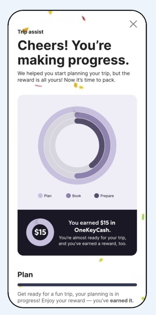
I wrote a variety of microcopy for this initiative, including:
Banners
Push notifications
Teasers (celebration moment when the user is part way through their to-do list)
Names for the steps of the list
Results
While my contract with Expedia ended prior to Trip Assist’s official launch, I consider the project to have ended successfully from a content design standpoint. The copy was also A/B tested with users.
The copy that I created resulted in:
A more satisfying user experience
Increased brand awareness
Incentivizes users to stay engaged for longer
Better retention

